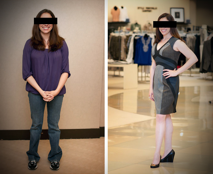
I love when TV shows do “instant makeovers”. The fashion guru wanders through a crowd and finds the diamond in the rough. They identify the fashion issues and make changes as needed. They make it seem so easy.
We did that this week.
We conducted dozens of Quickie Analysis packages on websites at the WFX conference/expo. We quickly viewed websites (for the 1st time); then identified recommendations for how they could be better.
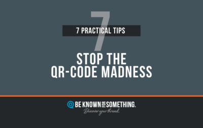
Here are 3 similarities we saw in almost every website:
- No Positioning. 97% will look in the upper left hand corner. Your logo should be there. Which most times it was. But right under your logo NEEDS to be a positioning. What you do to benefit your audience. What you want to Be Known For. People look there to see what you have to offer different from the competitors.
- No Priority. The page has lots on it; and nothing really stands out. Or everything does. Every page should clearly direct the viewer on a path. Ask yourself: What’s the first thing that catches my eye. Then: “What’s the #2 thing?” and so on. If it’s not clear; be sure to alter size or color to set the path.
- No Palette. Every brand needs a recognized palette. Usually a primary color, a secondary, then a tertiary color. This collection/palette needs to be owned by you. So people recognize it before seeing your logo.
Of course we saw web pages that contain far too many words. But that’s another issue entirely. I’ll deal with that another time. But one word to start you thinking. Edit. Please.