“Bless his heart.” I love that non-genuine statement we say when we see someone trying their hardest but not quite having the ability to accomplish the task. You know, the nervous, wet-handed soloist who attempts a song that is just a little too high for his voice.
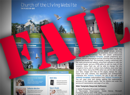
Most churches have purchased the URL to represent their church. And they’ve used the easiest way possible to create their website. Bless their hearts.
But few people end up going to their websites, while plenty of time is used to get “lots of stuff” on the site. Even the church staff realizes the website “isn’t the best.” The Church has to stop the madness. Stop spending time (and money) on something that’s not working. Why produce pages that no one are looking at?
For years we’ve assessed strengths and weaknesses of Church websites. Here are 3 website failures we see regularly:
- It reads like a book. When I open a book, I block off time to “get lost” in the pages. As I read, I often wish I could talk to and interact with the author. But I can’t. That’s the downfall of a book; but the benefit of a website. Web offers interactivity with the audience. You can ask questions on the web and have feedback. Web is all about engagement. Getting to know the person coming to find out about you. Just remember, the average person doesn’t block off hours to spend on a website like one would do with a good book. They only spend moments. Make sure you have easy and quick ways to get feedback on your website (i.e. forms, social media, comment sections, etc.)
- It tries to say too much. Originally, people simply put their brochures and publications online. And it failed. As analytics became mainstream, organizations realized that people don’t like reading long paragraph-style content on a screen. In fact, the average person spends about 10 seconds on a page. That’s about 50 words. And it appears that if you go much over the 50 word limit (in paragraph form) most will read even less. Write a lot; people read a little. So churches, trying to say too much about “very important” material, actually drive people away from reading it. Start editing!
- It’s about Programs, not People. Church is not the building, it’s the people. And Church is not the programs, it’s the people! Yet most Church websites organize around the programming and classes. The people get lost in the details. Make sure your website has lots of images that show the type of people you’re trying to attract. Making sure they’re having fun and looking engaged. Organize your menus so someone can identify what you do for them. And consider how they’d describe themselves (i.e. Married Men, Children-Grades 1-3, etc). People should be able to find “what’s in it for them” based on who they are. Don’t force them to figure out what “Elevate” is and who who attend.
Dale Carnegie reminded us that we “develop success from failures. Discouragement and failures are two of the surest stepping stones to success.” Most churches are dealing with these web issues and many are failing. It makes me optimistically imagine the success we’ll have on the horizon if we start learning from our mistakes! And, when we do, we can genuinely bless more peoples’ hearts.
This post originally appeared in the Weekly Update for the National Association of Church Business Administration (NACBA). Mark MacDonald is a regular writer for this and other national publications.