3 Ways Your Lobby is a Barrier

For years I’ve been conducting church Mystery Visits. Some call it a secret shopper but ultimately I’m walking into churches across the country with church culture knowledge coupled with the community’s demographic research. This formula produces definitive steps to helping churches become relevant while removing barriers to those entering for the first time.
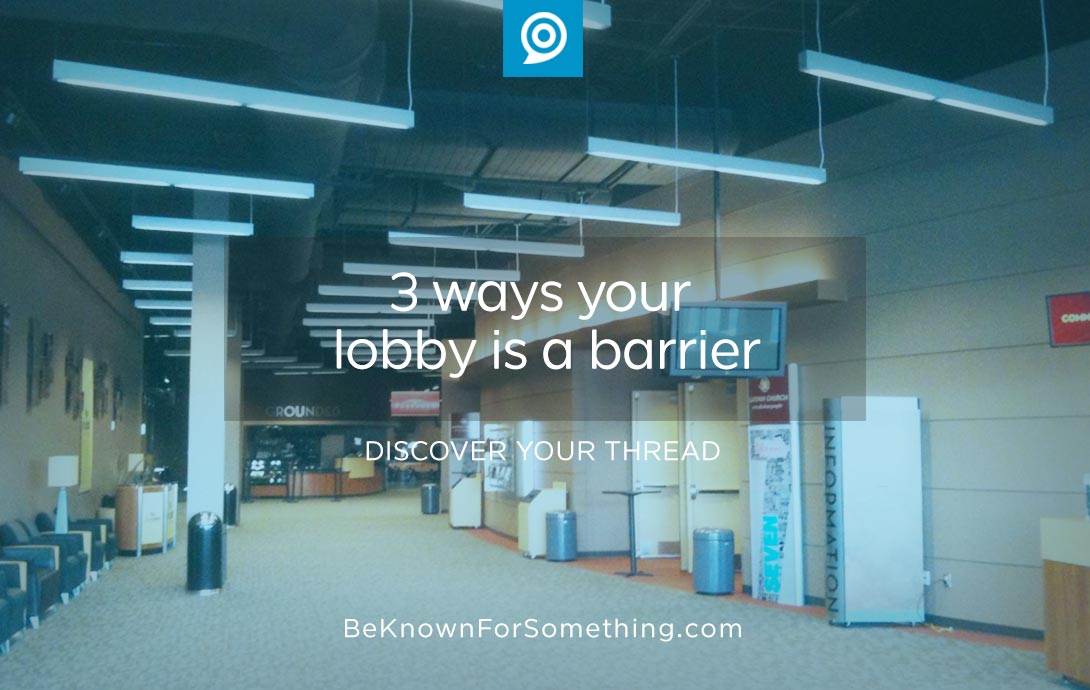
When someone enters a performing arts center, a church building, or an auditorium, the lobby is the second place that establishes the experience (the parking lot is first). That’s why a church lobby is so important!
In new places, the lobby makes you feel good or arouses concerns.
Here are 3 ways that lobbies (foyers) in a church building become barriers to the community:
- Church Wall Decor. The website houzz.com (an online community that discusses home architecture, interior design, and church lobby ideas) asked its members how often someone should update their home decor. Most said every 5 years. Public areas are even more important. Our rule of thumb? Decide who you want to come through your doors, visit their public hangout areas in their community, and compare your decor and surfaces. You want the community to feel you’re up-to-date. This makes people comfortable in a new location. Want to extend a church lobby decor’s lifespan? Create neutral surfaces that can be enhanced with trendy add-ons that can be economically changed. Remember that we usually don’t realize our surroundings are dated, so ask others who can be honest with you.
- Congestion. Your lobby has to corral people while allowing movement toward the main worship areas and other ministry areas. You also want people to feel free to stop and talk and meet new people if possible. When a lobby space is reduced in an area because of architecture or content, we call that a pinch. Pinches cause congestion in the area and can make your lobby feel unfriendly. Few people like congestion, so ensure that your lobby space is as large as possible by eliminating anything that isn’t necessary. It’s a balancing act to have your space well-designed with chairs and important informational kiosks, yet have non-pinched spaces to create a friendly gathering place.
- Community Friendly. Remember everyone entering your lobby is not familiar with your church terms. Ensure that each age group (seniors, children, youth, etc.) understands where to go without using internal sub-brands. Way-finding signage needs to be clear, direct, and obvious for all necessities: restrooms, exits, meeting areas, etc. Need help understanding what’s needed? Again, visit other large auditoriums that deal with large groups to see how they do it. Most of them spend thousands of dollars to ensure directional signage is obvious.
It’s difficult to do, but start in the parking lot and walk into each of your entrances like you’ve never been there before. Do it regularly on a Sunday morning, watch for confusion, and listen to questions. Remove every possible barrier so that your audience barely notices the lobby area as they walk through it to the worship areas.
Want 25 Game-Changing Resolutions?
Related Posts

Church Social Media: 5 Ways to Post with Purpose
Church social media is no longer optional. Your community is online every day, often for hours at a time. That

4 Church Branding Moves That Reach Your Community
Church branding is not about logos or colors. At its best, church branding helps your congregation engage the community in

25 Church Communication Mistakes We’ve Seen (And How to Avoid Them)
Back in 2001, we launched Be Known for Something from the old Krispy Kreme test-kitchen and marketing offices in Winston-Salem,

