Changes Needed in the Church: #3 Signage
When we first came to the US about a decade ago, we noticed that the signage is so much better here. Highway signs are everywhere. If you miss a sign, wait a few seconds, and you’ll drive by another one. Sometimes the redundancy is humorous. Unless you actually need the second or third sign!
When I’m driving, I used to panic if I missed the information along the roads, but now I realize I’ll probably see another sign within a few hundred yards.
Should I even mention billboards that clutter our highway right-of-ways? And the commercial signs around restaurants and businesses. American’s are communicators!
So, why the breakdown when it comes to churches?
- External Signs: Can your signs be clearly seen, read and understood from a reasonable distance? From cars that drive by? Does it have enough information so that someone in the community can make a decision to come? Often a website or phone number isn’t listed. Or the phone number is only good during office hours and not during “drive times”.
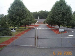
 Restrictive Signs: Drive or walk by your church on the road or sidewalk. I’m surprised by signs that say “no smoking” or “no skateboarders” or “no loitering”. UGH. What does that say? I know one church that has big gates in front of the church parking lot — and a large sign that says “NO Trespassing” and “KEEP OUT”. I guess they view visitors as trespassers. I don’t think restrictive signs have any home in the front of a church.
- Visitor Signs: Is it clear that visitors are welcome? (See my previous blog post) Is there clear visitor parking that makes people feel special? You can’t have too many welcome signs.
- Direction Signs: Some churches welcome their visitors in the parking lot, but forget about them in their buildings. Are your buildings clearly marked? Many churches have obscure names instead of descriptive names (Dr. Sam Reed Building vs Sunday School Classrooms) and once inside, guests are left to find their own way. Ask someone who’s never been in your church to find the nursery, bathrooms, worship center, classrooms, etc. — by themselves when there’s a crowd. Often the signs are too low and are hidden by all the others that are mingling. Don’t be clever with your signs, be clear!
Signage is important. The business world knows it. And we need to step up as a church! Spend some money on them, hire a way-finder communications company and a professional designer to use the right fonts, colors and substrates. You only have once to make a great impression!
Want 25 Game-Changing Resolutions?
Related Posts

4 Church Branding Moves That Reach Your Community
Church branding is not about logos or colors. At its best, church branding helps your congregation engage the community in

25 Church Communication Mistakes We’ve Seen (And How to Avoid Them)
Back in 2001, we launched Be Known for Something from the old Krispy Kreme test-kitchen and marketing offices in Winston-Salem,

Church Communication: 3 Shifts for How People Listen Today
Church communication often feels like fishing. Years ago, while traveling on a summer vacation, my parents pulled over beside a

