STOP! Look here. Now!
I just got back from talking with a large church in Atlanta area about their branding, marketing and communications. Driving the 6 hours both ways was a time of recharging for me.
I like to be alone.
Don’t get me wrong, I value family and friendship, I love meeting with clients, I even enjoy teaching seminars with lots of people. But I cherish the times that I can sit and think. My mind wanders from topic to topic. I solve the world’s problems, I dream towards the future.
And then, something interrupts and screams STOP! Look here. Now!
A billboard will catch my eye and I’ll read its simple message. It diverts my thoughts to what it wants.
You can do the same.
People are wandering around the internet with purpose (or sometimes with very little purpose); they’re thinking about many things. It’s hard to imagine what they are. But when they stumble or click on your website, you need to know when and where they’ll look.
And surprisingly, people who come to your website will:
- Take only 3 seconds to decide if your website is the place to be. You have to act quickly to get their attention.
- Always start in the same place on most pages. The upper left corner. It’s THE spot to catch their eye.
- Will need you to “stop” them with a message that quickly describes the benefits for them.
The solution? Make sure that 97% of the people who come to your website will see your logo (doesn’t have to be big); and a clear, simple, easy-to-remember positioning statement needs to be under the logo (that’s in the upper left corner).
It’ll be the first thing people see, and it’ll be the first step in delivering the promise that’s built into your positioning.
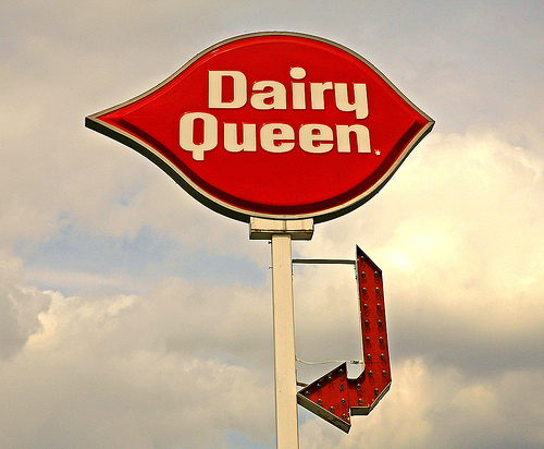
I’m a sucker for a good, short message. That’s why I ended up at a Dairy Queen on the way back home. I saw their billboard, realized their ice cream would be exactly the thing to satisfy my sweet-tooth.
Your positioning will do the same. People will stay and love your product.
Want 25 Game-Changing Resolutions?
Related Posts
Most Churches Will Waste Easter: Here’s Why
Just before Easter, the pressure starts to build. Extra services get added. Easter and church graphics are refreshed. Social media
Church Rebranding: 3 Warnings Before You Begin
Church rebranding can transform how your community sees and engages with your church. Done well, it strengthens clarity, trust, and
Church Perception: 3 Cautions For Clarity And Growth
Church perception directly affects whether people trust you, visit you, or ignore you. What your church is known for shapes

