Your Church Logo Doesn’t Need a Religious Symbol

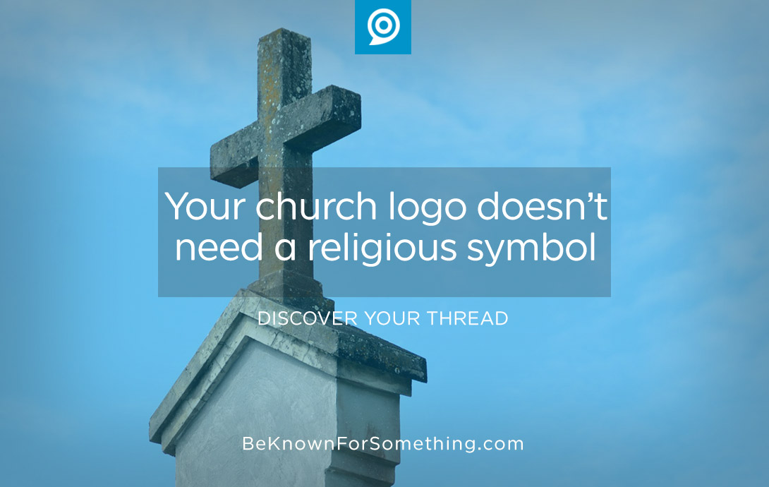
“Put a cross in it please”, said the Pastor who recently asked our studio to design a new logo for his Church. I believe he’s wrong so I challenged the notion. He said he wasn’t sure, but the committee he reports to requested it.
Good logos are rarely designed by a committee. But if you’re feeling the pressure from your congregation (or committee), here are 3 good reasons not to require a religious icon in your church brand:
- The Words Say Church. Most churches have the word “church” in their name so the excuse that “we’re a church, so we need it” isn’t valid. To the community (churched or non-churched), having a religious symbol in your logo feels redundant when your name states you’re indeed a house of worship. Restaurants don’t require an illustration of food in their logos, nor do car manufacturers require the shape of a vehicle! It doesn’t make sense for them nor does it make sense for you.
- Effective Logos Are Simple. They’re a memorable, visual representation of your brand promise. As people get to know your organization they’ll ascribe their feelings to your symbol. You simply want to have someone see your logo and remember the benefit they receive. Simplicity is important; in fact, a great logo can easily be reproduced by a seventh grader from memory. The easiest way to ensure that? Have one concept in your logo. Don’t have multiple ideas and symbols intertwined to create your brand. It’ll make your logo feel like an old-school crest. The simpler the logo concept, the easier it is to remember.
- Church Logos Need to Be Unique. A logo needs to differentiate your church from other churches. If every church required a cross, a dove, an angel, or similar, then all church logos would start looking the same. It would be impossible to set yourself apart from all the other houses of worship, and ultimately, you wouldn’t have a brand. People would confuse your ministries with other churches.
What if we have a religious symbol now? Consider keeping it if you like the brand (and it represents your ministry well) or if you have good brand equity (your community knows the logo and knows it’s yours uniquely). If not, it’s time to modernize and simplify your brand.
Are there any exceptions? Some denominational logos have religious symbols that can tie you to the larger collection of churches. There could be value in keeping that connection. Also, a subtle symbol that is truly unique (usually secondary) can add to the uniqueness of your logo. The trend of having the counter (reversed out) area creating a conceptual component could create a subtle religious symbol. It’s getting very difficult to discover a truly unique way to do this since so many churches feel compelled to try this.
So go ahead and create a simple, unique symbol that truly represents your ministry’s benefits in your unique local community, and ultimately ensure it’s not a barrier to someone visiting or attending.
Want 25 Game-Changing Resolutions?
Related Posts

4 Church Branding Moves That Reach Your Community
Church branding is not about logos or colors. At its best, church branding helps your congregation engage the community in

25 Church Communication Mistakes We’ve Seen (And How to Avoid Them)
Back in 2001, we launched Be Known for Something from the old Krispy Kreme test-kitchen and marketing offices in Winston-Salem,

Church Communication: 3 Shifts for How People Listen Today
Church communication often feels like fishing. Years ago, while traveling on a summer vacation, my parents pulled over beside a

