Cover Your Logo

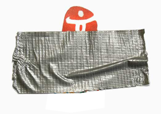
I was watching TV the other night and someone picked up their laptop and started using it. You know what the producers did, right? They had an awkward silver sticker covering the logo in the center of the open cover.
Everyone realizes it’s an Apple MacBook Pro.
Apple products have such a distinctive look for their product; that’s been consistent for years, that we know what the product brand is. Without the logo.
Or what if you see a distinctive red/yellow container with French Fries in it. There’s even a TV commercial for a V8 Fruit Smoothie that quickly shows a plastic container with a dome and a straw, and we instantly know it’s also a McDonald’s product.
Even without seeing the logo.
See. Your “brand” is not your logo. In fact, your brand is what you’re known for WITHOUT seeing your logo.
Would people know your website without the logo present? Or your worship guide without your Church name on it? How about a picture of your building without a dominant sign. Or your brochures, facebook page, etc.
Develop your “brand” without relying on your logo. Then (and only then) make sure your logo complements what you’re known for — and adds to the brand. It needs to be one additional visual element to work with.
Every brand needs:
- An emotional benefit (or promise)
- A color and font palette you “own”
- A unique memorable design
Oh… and a really great, simple, memorable, unique logo.
Want 25 Game-Changing Resolutions?
Related Posts

Most Churches Will Waste Easter: Here’s Why
Just before Easter, the pressure starts to build. Extra services get added. Easter and church graphics are refreshed. Social media

Church Rebranding: 3 Warnings Before You Begin
Church rebranding can transform how your community sees and engages with your church. Done well, it strengthens clarity, trust, and

Church Perception: 3 Cautions For Clarity And Growth
Church perception directly affects whether people trust you, visit you, or ignore you. What your church is known for shapes

