Develop Your Church Website by Doing These 3 Things

You’re trying to achieve a great online presence and develop your church website. You’re looking at other websites and wondering why they’re so informative and entertaining. You even get pulled into clicking around and finding several things that capture your interest. Why can’t you? Why does your website feel lackluster?!
It’s not as simple as it looks. The world is browsing through the internet. Half the population of the world says they search the internet daily. It’s estimated that Google get’s 63,000 searches every SECOND. A lot of people needing something and are looking.
Your church needs a website BUT it has to be good (or it’ll be ignored). From my decades of helping churches develop communication materials and developing many websites for others AND myself, here’s what I’ve learned. Better put your website hat down until you do these things:
- Understand your Audience’s Needs. Effective communication rises and falls on how well you know your audience. Don’t try to reach everyone. If you do? You’ll rarely reach anyone. Focus on a defined group of people with similarities: gender, age, needs, goals or whatever you want to speak to. A website needs images and videos. Show your audience. Make them the hero of your website. Talk about their pains, needs, and concerns. Demonstrate that you love them (as Christ loves). Create personas (google it) of your primary and secondary audiences. This is the foundational beginning of creating a solid brand and online presence.
- Discover your Thread. Jumping from your personas, you need to have a lane that you love traveling in. Make sure your personas are traveling there too. This thread (lane) becomes the guardrails for what you’re talking about, offering, and delivering in your ministries. In fact, limit your keywords around your thread concept (lane) and Google will love you. Just make sure your thread keywords will be part of the search history for your personas. Your website needs a simple, short, well-organized menu (following website paradigm) and it needs to answer the questions that pop into your personas’ minds. How do you deliver your brand promise? Your Brand thread? Brand story? Who are you? Why should I listen? The page contents simply add details.
- Have a Relationship Funnel. So, now you’ll get the attention of your personas who are searching and finding you. Now what? Well, that’s exactly what they’re asking! Make sure you understand where the average person (persona) is coming from. Then decide what you want them to achieve, solve, or become once they engage regularly with you. How many steps will it take to get there? Are you leading them through the steps online? Don’t assume your personas will want to attend an in-person service; ensure you can offer EVERYTHING online as your funnel leads them to the goal. Is finding Jesus at the beginning? Middle? End? Do you want interaction with them? How are you getting their information? All of these questions are website essential.
After fully developing these 3 areas, you’re ready for a user-interface. Go with the simplest design possible so nothing stands in the way of your content. Ensure the user’s experience is easy. And, please, continuously add and update your content. So have an easy content management system!
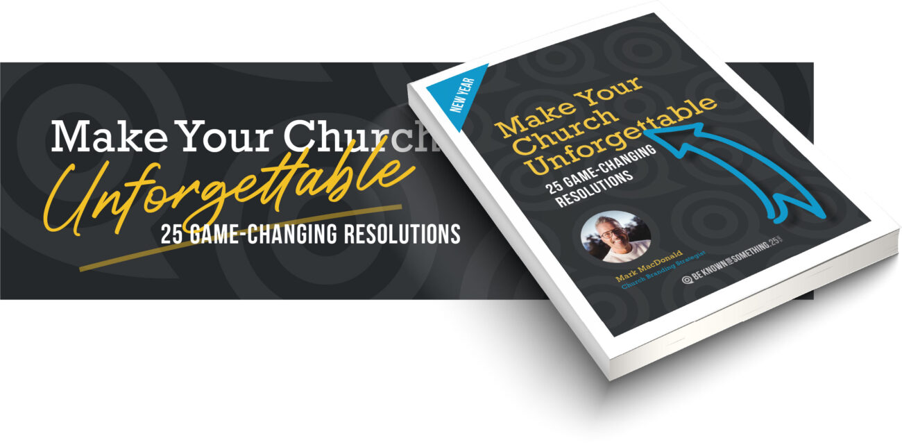
Want 25 Game-Changing Resolutions?
Related Posts
Church Rebranding: 3 Warnings Before You Begin
Church rebranding can transform how your community sees and engages with your church. Done well, it strengthens clarity, trust, and
Church Perception: 3 Cautions For Clarity And Growth
Church perception directly affects whether people trust you, visit you, or ignore you. What your church is known for shapes
Church Messaging Clarity: 3 Reasons Your Message Is Ignored
Why does church messaging clarity matter? Many pastors say, “The community isn’t listening to my church.” This concern is common.


