How to Resurrect a Church Website

Easter’s has come and spring is hopefully taking hold near you. New life is everywhere (especially as we emphasize the Gospel). Now, it’s time to resurrect your church’s website. Please!
If you created your website (and it still looks similar) more than 3 years ago, it’s dying. And if you’re not updating your website content weekly, it’s certainly dead feeling. Pssst: unfortunately, your congregation (and community) don’t like visiting the information grave.
Here are 4 ways to resurrect your website and make it new (looking). And something worth celebrating!
- Consider User Experience. Few people enjoy doing something they find unpleasant. Your website needs to be enjoyable for your congregation while friendly to your community. Do people in your church enjoy their experience of finding info on your website? How can you know? Ask them! Ask questions like: when’s the last time you visited our website? What were you looking for? Have you ever looked for something and not found it? On a scale of 1-10 how would you rate our website? What would you improve? Prioritize what you hear and start to fix them.
- Add Google Analytics. This free addition to your site (that can be added to most easily — Google it!) will give you actual metrics on what information is sought. And who is visiting. This is the foundation of resurrection. Discover the top pages to fix first. And if “important” pages aren’t in the top 15 pages, you can rethink the organization so they’re more discoverable.
- Reorganize for your Audience. This is the heart of what kills most websites. Someone must discover answers to their biggest questions. Most don’t like to click more than 3 or 4 times and only spend about 30 seconds on a page to find the answer. Organization must be a simple main menu (about 6 items) and about 6 dropdown items per main menu. This main menu should be ordered by importance from left to right. And it must make sense without knowing the church (this makes it friendly to the community). Most want About as the first menu item, and Contact as the last. Based on who goes to the website; the middle items will change (but usually you need a Ministries or Classes, New? or Guests, Events or Calendar, and/or Serve or Outreach tabs). Many churches have a Sermon or Resource tab too.
- Edit. Edit. Edit. What’s the key information that most NEED to know about your church? Usually it’s Times, Address, Event Info, Staff Contacts with Pictures, Ministry Info and Sermon Series info. That will keep almost everyone happy. Be careful if you want too much more — and review Analytics for current top pages. Imagine how simple a site would be if you had only this info! Like a breath of springtime air. Remove everything else from the main menu and it will help your site. Simply link to less important pages within your really important pages. And each page? Write a descriptive headline and then list the facts contained in several bullet points. Stop writing long paragraphs. You’ll be surprised how your website will spring to life. Less IS more.
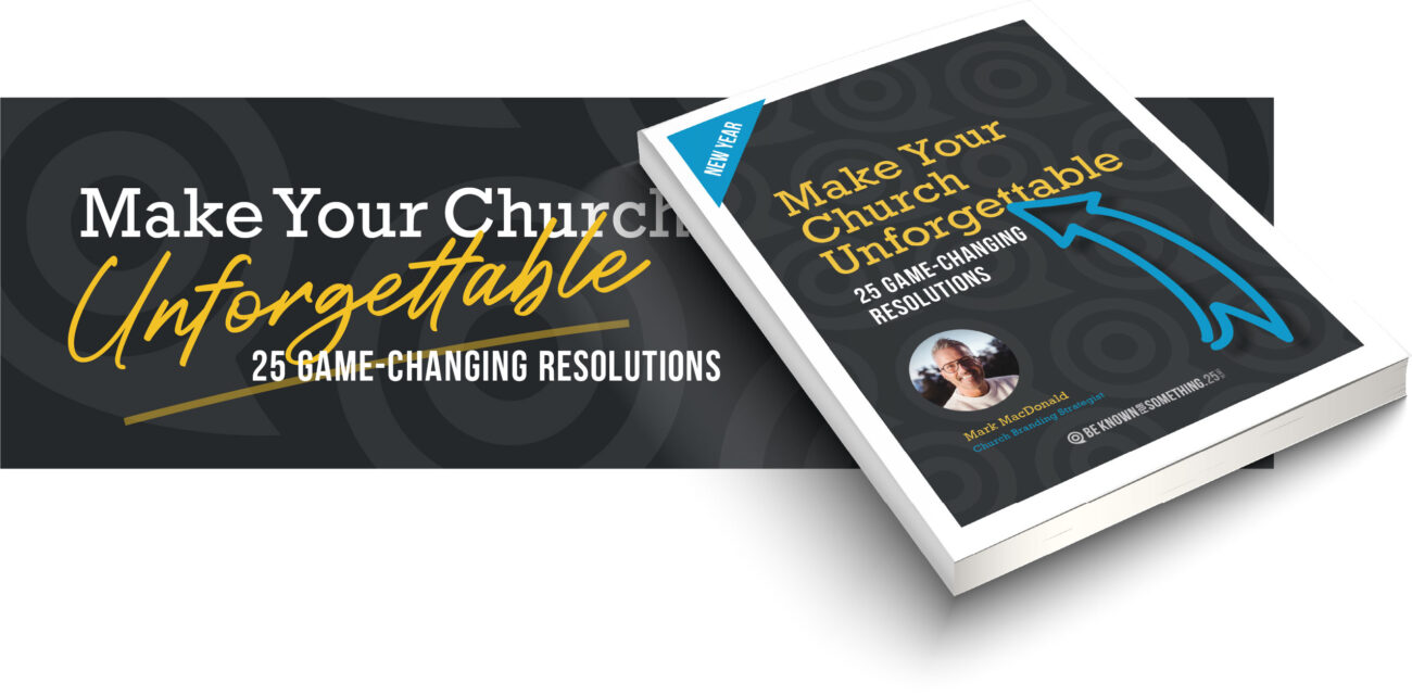
Want 25 Game-Changing Resolutions?
Related Posts

4 Church Branding Moves That Reach Your Community
Church branding is not about logos or colors. At its best, church branding helps your congregation engage the community in

25 Church Communication Mistakes We’ve Seen (And How to Avoid Them)
Back in 2001, we launched Be Known for Something from the old Krispy Kreme test-kitchen and marketing offices in Winston-Salem,

Church Communication: 3 Shifts for How People Listen Today
Church communication often feels like fishing. Years ago, while traveling on a summer vacation, my parents pulled over beside a

