Pastors, Make Your Church Logo Smaller

Have you noticed things are changing with communications? Probably not. You have so much going on that church communication issues probably don’t register.
So, allow me to call your attention to a change that speaks loudly to the church.
Make your church logo smaller. You may think that branding is all about your logo. But it’s not. You, personally may be known for a sweater vest, or polo and coordinating khakis. You have a distinctive look. Perhaps its your goatee, soul patch, or hair style. People, who know you, quickly identify you by the visuals they assimilate in a few seconds. But you’re much more than your looks — you have a style, a passion, a purpose that dwells deep within your heart that shapes your ministry and teaching. There are as many formulas that create a Pastor as there are Pastors. You’re unique; yet your foundational Biblical content isn’t.
Your church brand is similar. Your church logo, along with a standardized font and color palette coupled with a unique design style, is simply something that reminds the viewer of the deeper ministry that happens within the church. Your brand is actually what people think of when they DON’T see the church logo. The church logo simply works as a visual cue to that brand.
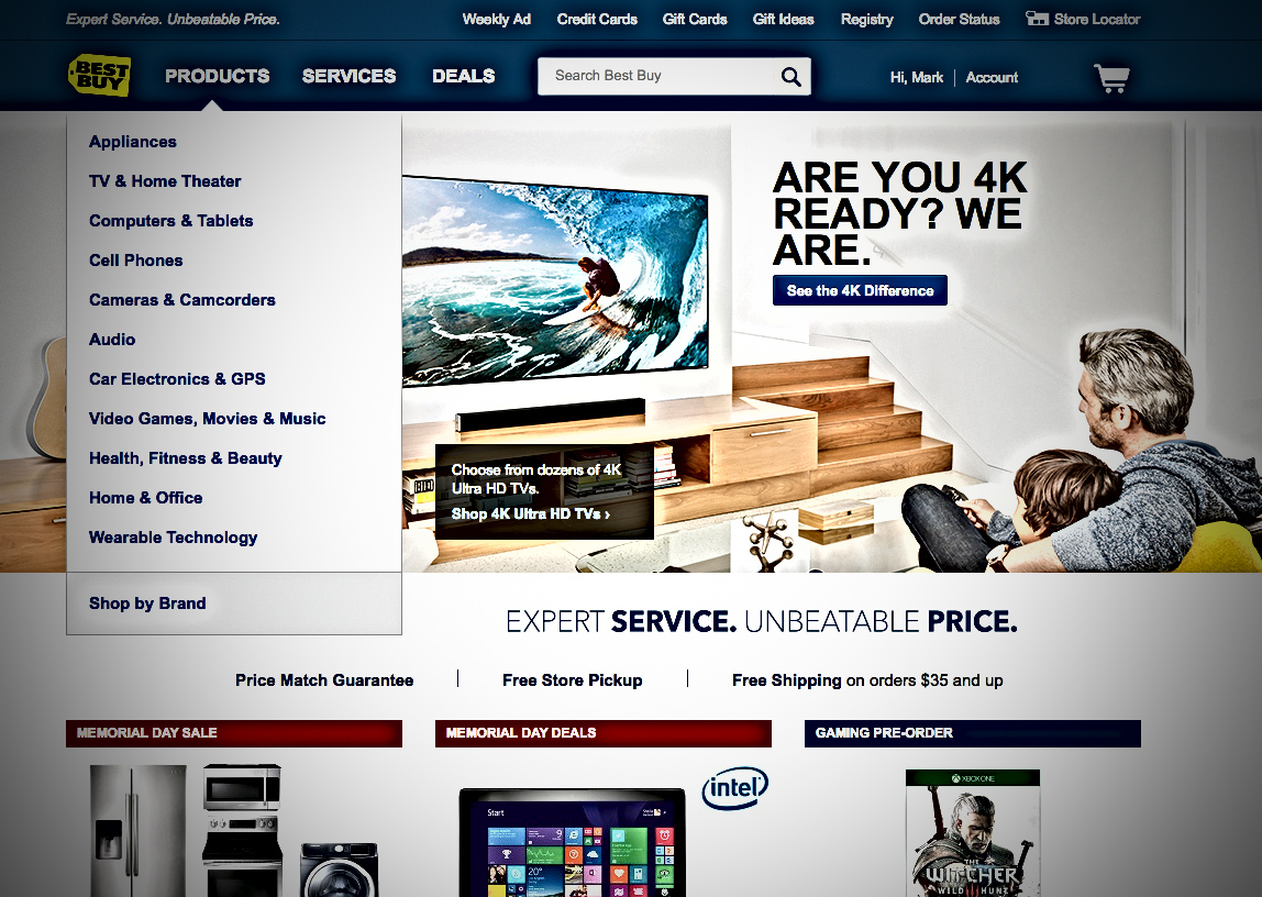
When people type in your URL, pick up a church brochure, or see your ministry ad, the church logo should be getting smaller and smaller. Why? First, take a look at www.target.com, www.walmart.com, and www.bestbuy.com — notice how their logos are smaller in the upper left of the home page. Even the area at the top (header) is getting slimmer. In fact, Target (at the time I’m writing this) doesn’t even say “Target” at the top — they just have their small iconic bullseye.
Are they all crazy? Maybe they don’t know what they’re doing! Nope. Instead, everything is so consistent with their designs that when you get to their webpage you probably don’t even need a logo to make you feel comfortable. They’re THAT good with branding. And the moment we know its Walmart, Target or Best Buy, we have an expectation of what they’re delivering. The logo can be reduced so much that the content area takes up more space. People come to a website to get content — what they need.
So, open up your website right now. Is your header bigger than what you just looked at? Your church logo larger? Is it your content area that’s larger and simple? Is the content what people expect of you? And in the brand voice they’d expect for your unique ministry style?
Pastors, stop relying on the church logo to tell people where they are. Instead let them know where they are based on something much deeper. It’s really who you are. Make it unique.
This post originally appeared in the Weekly Update for the National Association of Church Business Administrators (The Church Network). Mark MacDonald is a regular writer for this and other national publications about church communications and updating a church website.
Want 25 Game-Changing Resolutions?
Related Posts

Most Churches Will Waste Easter: Here’s Why
Just before Easter, the pressure starts to build. Extra services get added. Easter and church graphics are refreshed. Social media

Church Rebranding: 3 Warnings Before You Begin
Church rebranding can transform how your community sees and engages with your church. Done well, it strengthens clarity, trust, and

Church Perception: 3 Cautions For Clarity And Growth
Church perception directly affects whether people trust you, visit you, or ignore you. What your church is known for shapes

