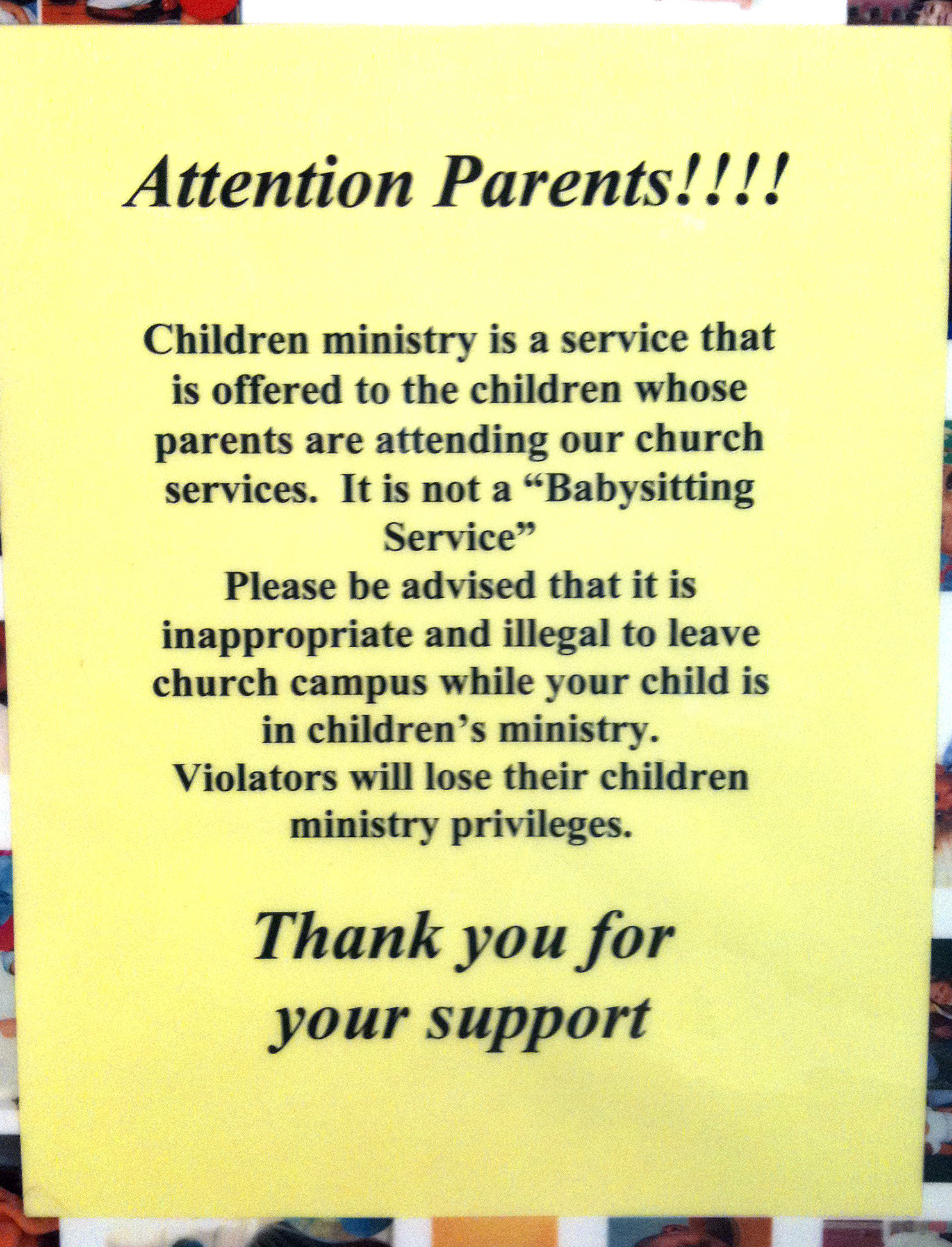
Attention!!! The wrong 1st impressions are dangerous!

I was recently visiting a church to teach a Ministry Leadership Workshop. It was my 1st time there, and I walked through the doors of the main entrance, not really sure where I was supposed to find the main worship area. I glanced around for a sign. Any sign. And the largest, brightest yellow sign caught my eye. Instead of a nice welcome, or a directional sign to show me the way, I got a stern warning. Nice.
It’s very similar when some churches have large, stark, ugly signs that tell me to shut my phone off before entering the worship center. I’ve even seen large projection slides that warn impending doom if my phone goes off during the service. I guess, the embarrassment of the moment isn’t enough.
This all begs the question: Should we have unwelcoming, warning and impending-doom signs in the church? I’m not talking about the “government-imposed” exit or no smoking signs. I’ve seen signs telling people to put my trash in the garbage cans. And the famous “Please have an attitude of worship in the Auditorium” or “No food or drink!” signs.
First impressions are so critical when someone is visiting your place of worship. It would be best for you to enter through your main doors and see what the impressions are when it comes to signage. Do you treat your people like they’re school children?
Here’s 10 thoughts about signage to consider:
- “Demand” signs are counter-intuitive to the “everyone’s welcome” attitude we should have in a church.
- These signs play into the perception that churches want people to attend, only if they’re willing to obey certain rules.
- Excessive warning signs just look petty. Like the Librarians or Trustees have taken over the House of Worship.
- No sign ever needs multiple exclamation marks. Ever (yes, I want to add the !!! here)
- Adding a thank you at the end of a stern message doesn’t soften it.
- Be sure that the signs people remember represent your church.
- Professionally designed signs are much better than any in-house sign that looks like it was Publisher produced.
- Simple is usually better.
- Laminated signs look tacky.
- Look in the local theater or auditorium to see how “secular” buildings do it. The church should be nicer, politer and held to an even higher standard.
Want 25 Game-Changing Resolutions?
Related Posts

Most Churches Will Waste Easter: Here’s Why
Just before Easter, the pressure starts to build. Extra services get added. Easter and church graphics are refreshed. Social media

Church Rebranding: 3 Warnings Before You Begin
Church rebranding can transform how your community sees and engages with your church. Done well, it strengthens clarity, trust, and

Church Perception: 3 Cautions For Clarity And Growth
Church perception directly affects whether people trust you, visit you, or ignore you. What your church is known for shapes

