Your Church Brand can Learn from Cattle Branding

Branding originated with cattle farmers who wanted to make sure others could distinguish their cattle from others when they roamed together in a field. They used a hot iron to mark them. Ouch.
Church branding is the same, but thankfully different. However, several principles are similar.
The logo needs to be unique. Imagine if every farmer decided to have line art of a cattle head in their brand. Imagine the confusion that could happen! A farmer’s branding iron can’t be too complex with small details and can’t have the same elements of other cattle farms to avoid confusion. Your church brand requires the same. It needs to be incredibly simple and avoid design elements that other churches are using (i.e. crosses, doves, flames, bibles, etc.). And I would extend it farther: make sure your logo avoids design elements and concepts of businesses in your community too. This is so difficult! It requires much thought and professional design expertise. Designing a lasting professional logo takes time and talent. Stop doing them yourself. It becomes a representative symbol for your church for a decade or more.
The logo needs to represent the “farm”. A brand is much more than the symbol. The symbol is just a visual reminder of the organization. Churches today tend to create ministry silos (the sign of an ineffective church brand). Instead, we need to create a brand that represents the entire “farm”. Your brand should talk to the overall solutions offered by your local church (that correspond directly with the concerns and problems of your reach area population). And that thread gets interpreted by each of the ministries within the church while reinforcing it with their communication.
People need to know where to find the owner. Usually a brand symbol is hung over the farm’s main gate so people can quickly identify ownership of the cattle. Imagine if the farm kept changing the symbol! Longevity is required to have a recognized brand. No one, except those who work on the farm, would be able to remember the current look. So our churches need to create a symbol that’ll last! Often, our places of worship switch branding elements too often because leadership grows weary of them. Please note: the brand is not for you; the brand needs to be for the community!
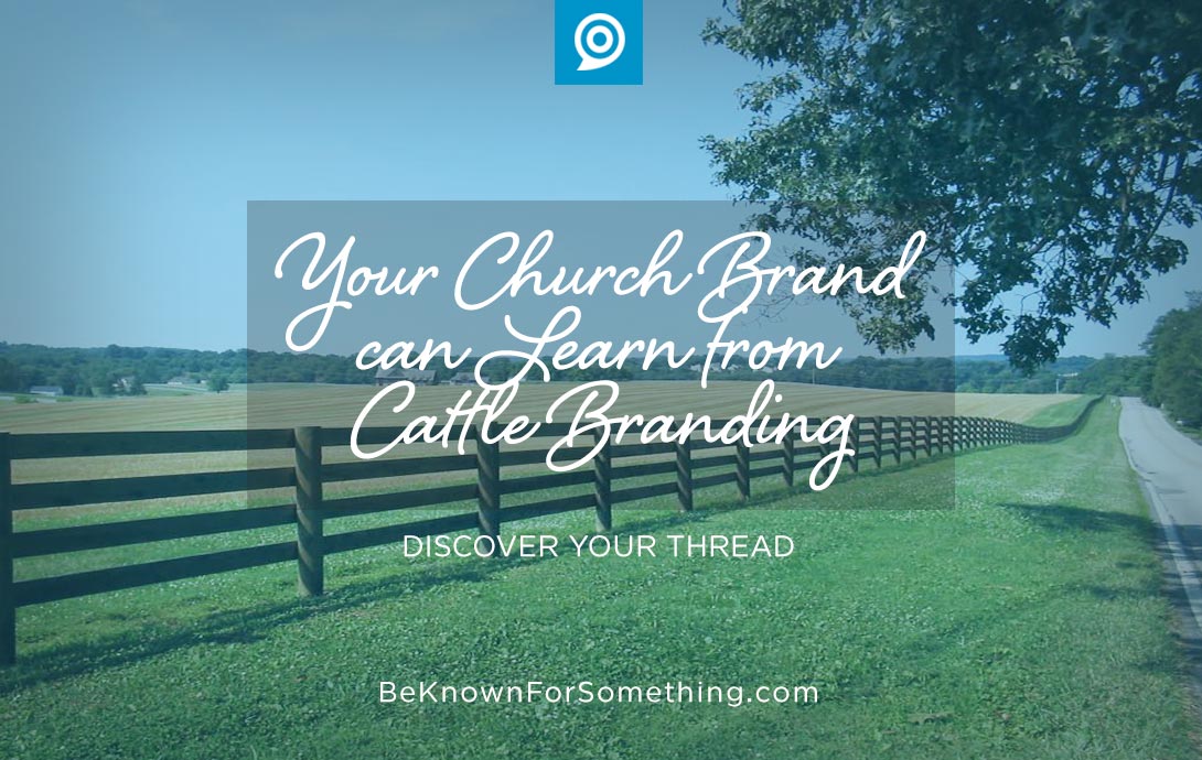
The cow hide limits what farm brands can look like. Today, we have websites, social media, printing, and video that offer very little limitations. We can practically do anything we want with our communications, but that doesn’t mean you should. You MUST set boundaries, limitations, and fences that restrict brand elements. Your brand standard (the manual that establishes the fences) should include: 2-3 colors, 1-2 fonts, 10-12 keywords (that people are looking for in Google), an emotional response to your brand, and an easy-to-remember solution thread (3-5 words that act as a tagline to remind what the visual brand will deliver). Again, this probably requires a trained brand strategist or designer.
Want 25 Game-Changing Resolutions?
Related Posts

4 Church Branding Moves That Reach Your Community
Church branding is not about logos or colors. At its best, church branding helps your congregation engage the community in

25 Church Communication Mistakes We’ve Seen (And How to Avoid Them)
Back in 2001, we launched Be Known for Something from the old Krispy Kreme test-kitchen and marketing offices in Winston-Salem,

Church Communication: 3 Shifts for How People Listen Today
Church communication often feels like fishing. Years ago, while traveling on a summer vacation, my parents pulled over beside a

