The 1 Color to Never use Around Food.
We're working on a branding project right now and our client asked some interesting questions about color. As I've learned through graduating from a Color Psychology Institute (who heavily tests colors) certain colors illicit various emotions and reactions.
It's no secret that I love food. I also enjoy trying new restaurants. Often I have to go quickly, since the restaurants rarely stays open longer than a few months. They seem to fail faster than any other business. I've seen statistics like a 96% failure rate. It's scary.
Some of the things that scream "This Restaurant is going to fail" are:
Signage looks homemade. They're hand-painted and busy. Or overly simple. Cheap-looking banners that seem like their kids painted them. Professionalism sells! Cheap says...
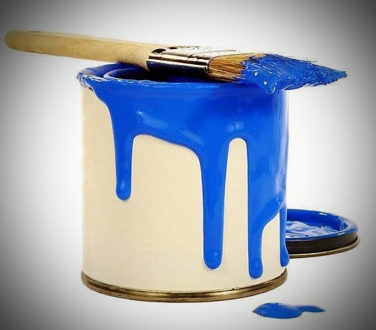
Need a Fresh Coat of Paint? Here’s a Easy Way to Tell.
At our office complex they're painting the restrooms. I must confess that I've not been upset with the color of them. Or the overall look. It was painted a light, off-white, beige with a lighter trim.
But now that it's painted a fresh blue color and pure white trim, the fixtures (and whole bathroom) looks whiter, brighter and cleaner. Exactly what you want for a bathroom.
Your Church just might need a fresh coat of paint. When's the last time you considered it? They say that every 3-5 years you should look at "freshening" the decor.
Often, when we're around something a lot, we don't notice things that others who, say once a week, visit. It's like the 1st visit to a person's...