Calm Down (Communication Design, That Is)
Marketing communication is tough. There’s so much to say and people are only half listening or reading.
After 3 decades of professionally designing and communicating, I’ve identified the main problem. Our communication is often delivered in a busy, non-organized, and complicated design.
So, calm down. Please. Or risk never being heard, read, or understood.
Here are 5 ways to get started:
Flatten and simplify. When it comes to design today, people don’t want to see layered and complex design. They want flatness. Simply, stop relying on glows or strokes around things to ensure they’re readable. Stop overlapping elements with lots of transparency. Simplify your design and make it quickly readable. The curse of bad communication design is that art trumps...
Your Church Brand can Learn from Cattle Branding
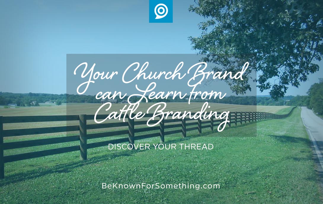
Branding originated with cattle farmers who wanted to make sure others could distinguish their cattle from others when they roamed together in a field. They used a hot iron to mark them. Ouch.
Church branding is the same, but thankfully different. However, several principles are similar.
The logo needs to be unique. Imagine if every farmer decided to have line art of a cattle head in their brand. Imagine the confusion that could happen! A farmer’s branding iron can’t be too complex with small details and can’t have the same elements of other cattle farms to avoid confusion. Your church brand requires the same. It needs to be incredibly simple and avoid design elements that other churches are using (i.e. crosses, doves,...